
Interactive world data map generation tool
Published:
This page serves to discuss the usage and behaviors of the Interactive world data map generator tool that I wrote. The GitHub page’s README covers required packages and very basic usage, so this page seeks to take a deeper look at the intended input formats and settings, the logic behind some of the code’s options, and how the maps generated by this code differ from those generated by the base Pygal library which this code uses.
This code serves to easily create interactive world maps such as the one below showing the number of Olympic medals won by each country. The code’s input data can be in an Excel spreadsheet, a .csv (comma separated values) file, or a .tsv (tab separated values) file. (Any other file formats provided are assumed to be CSV files.) It outputs a Scalable Vector Graphics (SVG) file containing the map and an HTML file with the map embedded along with a table of all of the data on the map.
Hovering over a country reveals the value associated with it (if nonzero). Hovering over each bin in the legend will highlight all countries in that bin, and clicking the bins in the legend will toggle whether those countries belonging to each bin are shown on the map or not.
[view standalone SVG in fullscreen]
![[view standalone SVG in fullscreen]](https://hratliff.com/files/world-map-tool/standalone/Olympic_medals_per_country.svg)
Basic operation
When the code is ran, the GUI shown below will pop up (but with default entries). This article will discuss these various settings.
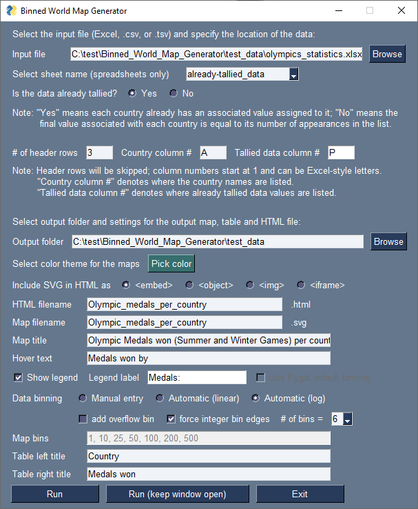
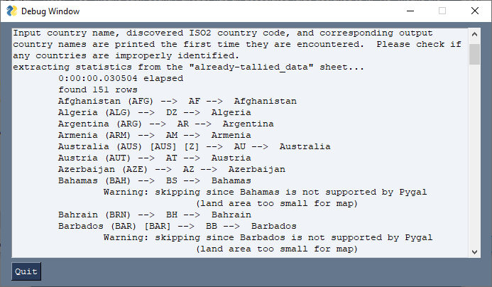
The default value of “Input file” will be either a user-provided file path taken from the first line of a file titled “default_path_to_data_file.txt” if the code detects this .txt file in the working directory, or it will default to “default.xlsx” in the current working directory. A different file can be selected using the Browse button or by manually entering a new path. When the code is ran for the first time for a given input file (or if the input file has been updated since the last time the code was ran), the code will carefully parse the file and print diagnostic information to the screen, allowing you to check if the listed countries are being properly identified. If “Run” is selected, the window will close and this information is printed to the terminal as usual; if “Run (keep window open)” is selected, a popup window (shown below) to which the terminal output is redirected will appear.
Keeping the window open can be useful for trying different colors and settings quickly. After the file has been carefully parsed, its data and the GUI’s settings are saved to a file of the same name as the input data file but ending with the .pickle extension instead. Then, in future cases when the code is ran, if it discovers that this pickle file is present in the same folder as the source data file and that the source data file has not been modified since the pickle was created or last updated, the code will use the data stored in the pickle file instead of rereading the source data file, speeding the code up notably. Additionally, anytime the code is ran and the corresponding pickle file is discovered, the GUI will automatically change its settings to match those used the last time the pickle file was updated, and any new or modified settings will be saved to the pickle file for future iterations. For Excel spreadsheet files, you can select data from any of its sheets, and the pickle file will independently save the data from and GUI settings used for each sheet. Updating the Input file or the sheet name causes the code to search for the pickle file and to update the GUI if found.
Tallied vs Untallied data
The most important option provided by the code is the type of data: tallied or untallied. Tallied data is presented as a list of countries with values already assigned (population per country, Olympic medals won per country as shown at the top of this page, etc.) and would be in a spreadsheet/data file tabulated as shown below. In this case, the code needs to know the column numbers for both where the country names are listed and where the data values are listed. If a country is identified multiple times, the values from each are summed; for instance, in this example the number of medals for Germany includes those from “Germany”, “West Germany”, “East Germany”, and the “Unified Team of Germany”.
| Country | Total medals won (Summer + Winter Games) |
|---|---|
| United States | 2828 |
| Russia (and Soviet Union) | 1776 |
| Germany (modern, East, West, and United Team of) | 1754 |
| United Kingdom (Great Britain) | 883 |
| France | 840 |
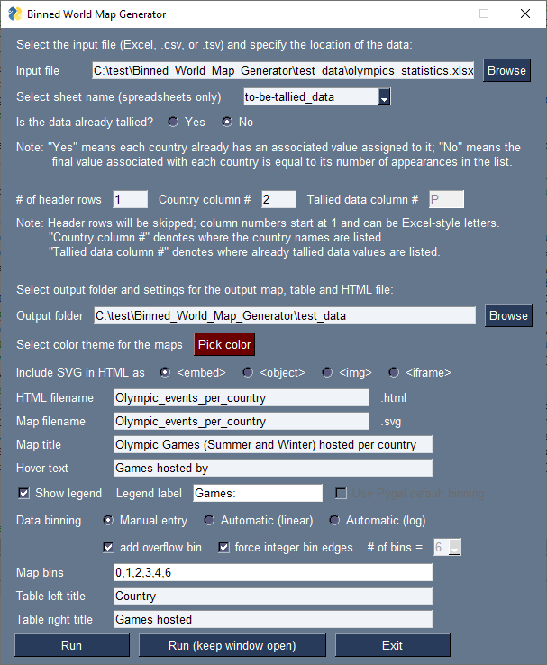
Untallied data consists of just a list of countries, and the number of appearances of each country is counted. This would be useful if you hosted an international event, had a list of all of the attendees and their countries, and wanted to make a map illustrating how many attendees you had from each country. The code takes care of summing up the number of attendees per country for you. The example of this type of data presented below is generating a map of the number of Olympic Games (Summer and Winter) hosted by each country provided a list of the locations of all Olympic Games. For the sake of this example, canceled events are excluded while tentative future events are included. Some of the data is presented in the table below.
| City | Country | Year |
|---|---|---|
| Atlanta | United States | 1996 |
| Nagano | Japan | 1998 |
| Sydney | Australia | 2000 |
| Salt Lake City | United States | 2002 |
| Athens | Greece | 2004 |
| Turin | Italy | 2006 |
| Beijing | China | 2008 |
| Vancouver | Canada | 2010 |
| London | United Kingdom | 2012 |
| Sochi | Russia | 2014 |
| Rio de Janeiro | Brazil | 2016 |
| Pyeongchang | South Korea | 2018 |
To generate the map, the number of instances each country name appears in the data is counted. For example, the United States appears 2 times in the above table (but a total of 9 times in the Wikipedia table including past and future events). Once the data is tallied, the map below can be generated.
[view standalone SVG in fullscreen]
![[view standalone SVG in fullscreen]](https://hratliff.com/files/world-map-tool/standalone/Olympic_events_per_country.svg)
For both tallied and untallied data, the code also always needs to know how many header rows there are (rows at the top which will be skipped). And, as noted in the GUI, letters (as used by Excel) may be used for the column numbers. If Excel-style letters are provided for column numbers for non-Excel files, they will be converted to integer numbers.
The map of Olympic events per country above was generated with the following settings in the GUI:
Output options
The output folder will default to the same directory as the input file, though this can be customized. This is where the output .svg and .html files will be written, and their filenames can be customized.
The maps have a single base color. The countries in the highest bin will adopt this color while lower bins will have this color mixed with increasing amounts of white. Clicking the “Pick color” button opens a color picking window, and the color of the button afterward will be updated to reflect your selection.
The HTML embedding options for the SVG file are discussed in detail later on this page due to being a slightly more complicated topic.
Most of the text fields have self-evident names, controlling the map title, the text appearing in the boxes when hovering over a country on the map, the text in the legend in the bottom left of the map, and the column titles of the HTML table. UTF-8 characters are supported in these fields, not just ASCII.
Binning
The custom binning of data is one of the most valuable features of this tool, and a variety of options are available. In principle, there are four main binning styles: (1) providing manual bin edges, having the code automatically calculate evenly spaced bin edges on either a (2) linear or (3) logarithmic scale, or (4) using the default binning structure of Pygal, ignoring all of the other binning features (not recommended and only available when “Show legend” is disabled).
When manually entering bins, they must be provided as a list of increasing numbers separated by commas. Note that you are specifying bin edges here, meaning the nominal number of bins is one less than the number of values provided.
When automatic binning is selected, the code automatically constructs evenly spaced bins in either linear or logarithmic space, and you can specify the desired number of bins.
There are two special options which impact the meaning of each bin: (1) the overflow bin and (2) forcing integer bin edges. When the overflow bin is enabled, an extra bin containing everything above the original final bin maximum is added to the plot. In the case of the automatically generated bins, this effectively just increases the selected number of bins by 1.
Forcing integer bin edges does a few things. First, the automatically generated bins edges, which often are decimal values, are forced to be integers. (Manually entered bin edges are not affected.) Second, it causes the data to be interpreted as if it were “counted” integer data (regardless of whether it actually is). When this is the case, the left edge of each bin after the first one is increased by 1. When forced integer bin edges are disabled, the data is assumed to be decimal, and the bin edges are set to contain all numbers between the minimum and maximum listed value.
By default, both of these options, the additional overflow bin and forced integer bin edges, are enabled. The behavior of these two settings is illustrated in the table below where “V_lower” and “V_upper” are consecutive bin edges (either specified manually or automatically calculated) and where square brackets [] include the values next to them ([v1,v2] means ≥v1 and ≤v2) while parentheses () do not include the values next to them ((v1,v2) means >v1 and <v2).
| Binning Logic | ||
|---|---|---|
add overflow bin = TrueYes | add overflow bin = FalseNo | |
force integer bin edges = TrueYes | First bin: [V_lower,V_upper] Mid bins: [V_lower+1,V_upper] Last bin: [V_lower+1,V_upper] Overflow bin: [V_upper+1,∞) | First bin: [V_lower,V_upper] Mid bins: [V_lower+1,V_upper] Last bin: [V_lower+1,V_upper] Overflow bin: n/a |
force integer bin edges = FalseNo | First bin: [V_lower,V_upper] Mid bins: (V_lower,V_upper] Last bin: (V_lower,V_upper] Overflow bin: (V_upper,∞) | First bin: [V_lower,V_upper] Mid bins: (V_lower,V_upper] Last bin: (V_lower,V_upper] Overflow bin: n/a |
As an example, the resulting bins from the four permutations of these special options for manually provided bins 1, 5, 10, 20, 50 are shown in the table below.
| Special options settings | Produced bins |
|---|---|
force integer bin edges = True, Yes add overflow bin = True, Yes | [1,5], [6,10], [11,20], [21,50], [51,∞) |
force integer bin edges = True, Yes add overflow bin = False, No | [1,5], [6,10], [11,20], [21,50] |
force integer bin edges = False, No add overflow bin = True, Yes | [1,5], (5,10], (10,20], (20,50], (50,∞) |
force integer bin edges = False, No add overflow bin = False, No | [1,5], (5,10], (10,20], (20,50] |
And as you may have noticed on the Olympic Games hosted map, when forced integer bin edges is enabled, any bin with width 1 and containing only a single value is printed to the legend as that single value rather than as a range.
HTML embedding options
Several different options are provided for embedding the SVG file into HTML since different web backends may behave differently with each method and only allow some to work. While <object> is generally recommended by online resources, <embed> is used for the maps shown on this page. It is generally not suggested to use <iframe>, but it is included for completeness. All three of these nominally let the SVG file behave like normal, retaining all of its interactivity. When using <img> this interactivity is completely destroyed, and the SVG will just be rendered as a static image. (Note that none of these options affect the SVG file, just how it appears in the HTML page.)
By default, the SVG files look fine in the unstyled HTML file produced or on their own. However, depending on your web backend, you may also need to make some minor modifications to the HTML code and the SVG file itself for it to render optimally (in terms of the gray border’s size and positioning) on your own webpage. For the SVG files shown on this page, I opened the SVG file in a text editor (like Notepad++), and on line 2 within the <svg> tag I replaced viewBox="0 0 800 600" with viewBox="0 100 800 400" preserveAspectRatio="xMidYMid meet" width="100%" height="100%" to get the positioning and framing just how I wanted it. When inserting the Olympic events map from earlier into this page, I used the below HTML code:
<div class="fluid-width-video-wrapper" style="padding-top: 75%; text-align: center;">
<embed src="/files/world-map-tool/Olympic_events_per_country.svg" type="">
</div>
Again, depending on your own backend and styling (CSS and/or <style> tags), you may need different adjustments to make the maps appear just right on your own webpages.
How do these maps differ from those made with stock Pygal?
The Pygal library is used by this tool for generating the basic core of these maps. The map generation capability is just one of a variety of very handy functions of the Pygal library. However, there is quite a bit of value added by using this tool versus Pygal on its own.
Below is the same map as presented at the top of this page but without any of the additional processing performed by this tool aside from the parsing of the data spreadsheet to automatically populate the dictionary object (with ISO2 country names as the keys) that Pygal accepts as its input, something you would need to construct manually if using Pygal alone.
[view standalone SVG in fullscreen]
![[view standalone SVG in fullscreen]](https://hratliff.com/files/world-map-tool/standalone/Pygal_only_medals-map.svg)
So, in addition to handling the rather time-consuming task of manually constructing the input dictionary object, using Pygal on its own for constructing world maps can produce rather lacking results. There is no way to control the binning of the data, meaning for some datasets the maps are not particularly informative to look at. Additionally, there is no way to display the binning used by Pygal, meaning the maps feel subjective in nature as well, and the text appearing in the legend is identical to the next in the hover boxes. You may also notice that some of the country names used by Pygal are either uncommon, unnatural, or slightly controversial.
This tool provides a GUI for easily generating these maps, an automated way to parse and tally data (a nontrivial task in regards to translating country names in a large variety of formats to ISO2 codes, thanks to coco), the ability to fully customize the data binning structure, the ability to customize every visible descriptive text field independently, and presenting the country names in more common formats (again, thanks to coco).